Overview
Research
Problem Statement

Prototype & Insights

Final Design
Reflection
Role
UX Designer
Timeline
November 13, 2025
Project Type
Designathon (8 hours)
Tools/ Skills
Figma, Figjam, Market Research, User Research Prototyping,
MindMate
A health app designed for high-school students by a high-school student
Overview
As a high school student feeling overwhelmed by academics and the pressure of planning for my life after high-school, I realized many of my other peers were struggling with that same mental challenge. This inspired me to design a mental health app aimed to provide students with accessible support and resources to navigate their emotions and life stressors.
Research
Market Research
I looked at top mental-health apps and noticed they weren’t built with students in mind.
User Interviews
Understanding the target audience more
I surveyed 6 current high-school students and a previous graduate to gain more insight into this problem.
My research goal was to discover the key pain points in the existing counselling system at our school, and to explore current methods students use to deal with their stress and anxiety.
I created an affinity map to organize key-findings from the user surveys.
After synthesizing all the research, these were the key findings that shaped the direction of the solution:
100%
Students felt overwhelmed during high-school. Most of those students had no tangible way to solve their stresses and anxiety
65%
Students had never utilized or even heard of our school counsellors so that they can access mental health resources
80%
Students would like privacy when expressing their concerns and problems to a counsellor.
From there, I created a insights and needs chart. The insights show what students are struggling with day-to-day, and their deeper motivations. The needs translate those struggles into clear design requirements

Insights

1. Community

Students value community in their lives, but sometimes can’t afford to spend time with them due to their academics

2. Resources

Students do not have resources to alleviate stressors in their lives

3. Flexibility

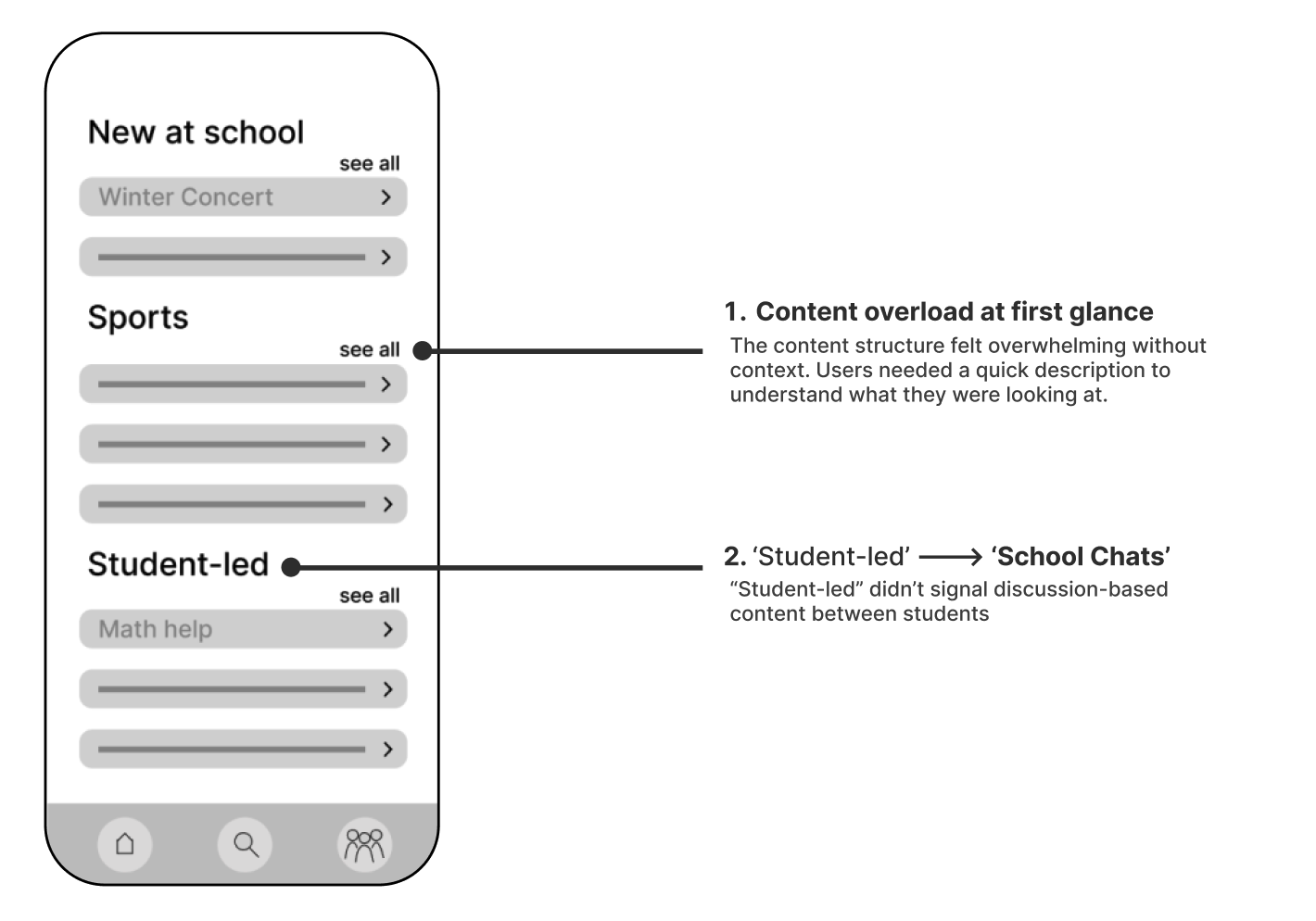
Students would appreciate alternative options to private counsellors, then talk to ones at school

Needs

1. Community

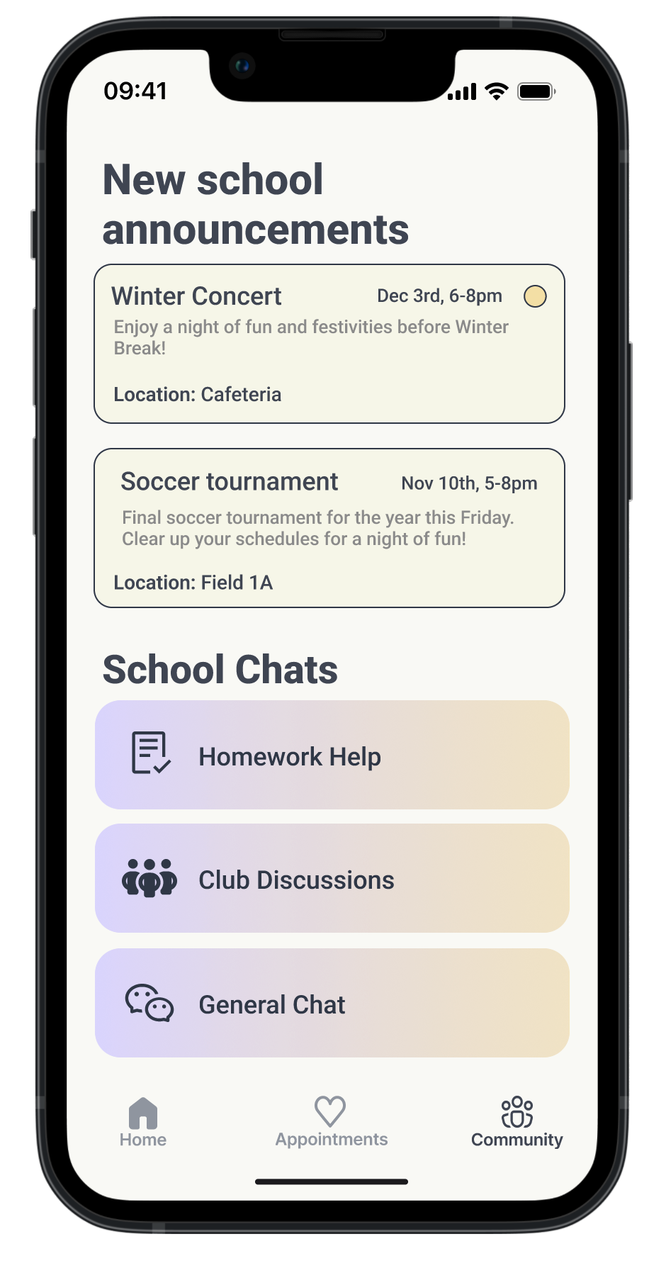
Stronger student community to overcome academic stressors easily and spend more time with family and friends.

2. Resources

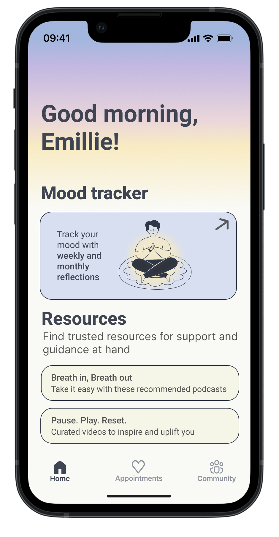
A way to access resources that help  identify stressors and provide ways to overcome them

3. Flexibility

Option for students to choose between in-person school counselling and online on-call therapists

User Persona's
Finally, I created a user persona to humanize the research and guide my design decisions moving forward
Emilie

Senior-Student, 18

Highschool in Calgary

Goal
I want to be able to balance my school work and social life better. I feel like I’m constantly drowning in assignments and don’t have time to actually enjoy my high-school years.
Frustration
I’m doing well in school but everything feels like a deadline, and I can’t get a hold of our school counsellors for a solution.
Interest
Unaware school counsellors were available
Easier ways to stay updated on school events
Mark

Freshman, 16

Highschool in Calgary

Goal
I want to stress less about what I’m going to do after high school and feel like I need some direction or clarity.
Frustration
I talked to school counsellors before but it didn’t help. I want help that actually listens to what I’m going through.
Interest
Would like digital tools that offer clear guidance
Uses tools to help plan his future
Problem Statement
High School students are interested in using resources to ease their high school journey, but these resources are not widely known
How might we provide easy access to supportive mental health resources for students to use while promoting a sense of community at school? 
Prototype & Insights
Lo-fidelity Wireframes
Usability Testing
I ran 5 usability sessions where users navigated my prototype and shared what felt confusing or hard to use.
These sessions showed which parts of my original lo-fidelity wireframes were unclear or incomplete.
Below, I highlight what needed to change and why.
Final Designs
High-Fidelity Designs
After continuous testing, iteration and extensive research, the final design took shape.
  1. Simplified layout with a single primary focus area (Mood Tracker first)
  2. Content grouped by importance to support easy navigation
  3. Resources are secondary; not the first thing students see
  1. Prioritized book an appointment as the main action to reduce cognitive load
  2. Renamed page to “Appointments” for clarity
  3. Added short descriptions so students know who they’re booking with and why
  1. Removed resources to keep this page focused on conversations only
  2. Renamed the section to “School Chats” for clearer purpose
  3. Added concise descriptions for quick understanding
Design Concept
Reflection
What I'd do differently next time...
As my first full end-to-end design project, it taught me a lot, and there are a few things I would do differently next time
Explore technical feasibility

I would consider the technical limits of adding announcements and chat features into a real public-school system. Knowing what is actually possible would make the design more grounded.

More qualitative interviews

I wish I had done more in-person interviews to ask follow-up questions and clarify student motivations. It would have helped validate my ideas with more confidence.

Better adhere to WCAG guidelines

I used gradients a bit too freely, and it hurt readability. Next time I would follow WCAG standards more closely and keep the visuals cleaner.