Loading...

Introducing an AR note feature to BeReal

TIMELINE

3 months
(Apr 2026 - June 2026)

ROLE

Product Design

Product Builder

SKILLS

Design Engineering

User research

Rapid Prototyping using AI

Tools

VS Code

Claude Code

Vercel

Figma

CONTEXT

BeReal: the 'anti-instagram' social media app

BeReal: the 'anti-instagram' social media app

BeReal was never designed to be dopamine-inducing with an infinite scroll. Just one unfiltered photo a day taken when the app says so.

BeReal was never designed to be dopamine-inducing with an infinite scroll. Just one unfiltered photo a day taken when the app says so.

As part of my externship, I was tasked with designing a feature that drives monthly engagement without hijacking attention spans. Anything I built had to stay true to BeReal's mission of not having people become addicted to their phones.

As part of my externship, I was tasked with designing a feature that drives monthly engagement without hijacking attention spans. Anything I built had to stay true to BeReal's mission of not having people become addicted to their phones.

PROBLEM SPACE

BeReal stopped the moment you closed the app

BeReal stopped the moment you closed the app

BeReal lost more than half its monthly active users from 73 million → 33 million. Users still valued the two-way camera and the lack of a dopamine-inducing feed.

But that's where the design stopped. Users closed BeReal and opened TikTok or Instagram: the feeds it vowed against becoming. BeReal was built to make people log off, but It never gave them anywhere to go. That gap became my opportunity space.

BeReal lost more than half its monthly active users from 73 million → 33 million. Users still valued the two-way camera and the lack of a dopamine-inducing feed.

But that's where the design stopped. Users closed BeReal and opened TikTok or Instagram: the feeds it vowed against becoming. BeReal was built to make people log off, but It never gave them anywhere to go. That gap became my opportunity space.

How might we give users a reason to return to BeReal without hijacking their attention?

How might we give users a reason to return to BeReal without hijacking their attention?

THE SOLUTION

An AR experience that turns photos into hidden notes users have to go outside and find

An AR experience that turns photos into hidden notes users have to go outside and find

MARKET RESEARCH

Why did everyone stop using BeReal?

Why did everyone stop using BeReal?

To design a new feature for BeReal, I first looked into why more than half its users left. Across articles, Reddit, and Substack, the same complaint surfaced: BeReal got boring.

To design a new feature for BeReal, I first looked into why more than half its users left. Across articles, Reddit, and Substack, the same complaint surfaced: BeReal got boring.

As one user put it: there was no deeper engagement loop. The daily photo quickly lost its novelty and stopped giving people a reason to come back.

As one user put it: there was no deeper engagement loop. The daily photo quickly lost its novelty and stopped giving people a reason to come back.

FEATURE IDEATION

Which idea was worth building?

Which idea was worth building?

Initially, I had several ideas for features that could bring users back to the BeReal. I used the RICE framework to score each idea I had based on Reach, Impact, Confidence, and Effort.

Initially, I had several ideas for features that could bring users back to the BeReal. I used the RICE framework to score each idea I had based on Reach, Impact, Confidence, and Effort.

01

Close-friends only thread for BeReal photos

Close-friends only thread for BeReal photos

2.0

2.0

-

Low Reach
(only impacts users who use feature)

Low Reach
(only impacts users who use feature)

+

High Impact
(valuable to users using feature)

High Impact
(valuable to users using feature)

02

Yearly 'Wrapped' of photo's in the past year

Yearly ‘Wrapped’ of photo’s in the past year

1.7

+

High Reach
(reaches all active users)

High Reach
(reaches all active users)

-

Low Impact
(only matters once a year)

Low Impact
(only matters once a year)

03

Interactive AR map with hidden notes left by friends

6.0

+

High Reach
(reaches 100% of active users)

High Reach
(reaches 100% of active users)

+

High Impact
(re-engages users between BeReal's)

High Impact
(re-engages users between BeReal’s)

High Impact
(re-engages users between BeReal's)

The AR sticky map scored highest at 6.0. The close-friends thread reached too few people; Yearly Wrapped only mattered once a year.

The AR sticky map scored highest at 6.0. The close-friends thread reached too few people; Yearly Wrapped only mattered once a year.

User Flow

User Flow

Mapping how the AR experience should look like for first-time users.

Mapping how the AR experience should look like for first-time users.

TESTING & ITERATIONS

Usability testing pain points

Usability testing pain points

I ran 3 usability testing sessions to find out whether my designs were user-friendly and intuitive. I had participants complete 4 given tasks & think aloud to assess which parts of the AR experience were confusing and not intuitive.

I ran 3 usability testing sessions to find out whether my designs were user-friendly and intuitive. I had participants complete 4 given tasks & think aloud to assess which parts of the AR experience were confusing and not intuitive.

"Wait…what am I supposed to look at? I don't see anything"

Observation

Pain Point

01

Visual Cues were hard to understand

Visual Cues were hard to understand

Location dots were hard to distinguish and were easily missed 3/3 times

Location dots were hard to distinguish and were easily missed 3/3 times

Observation

"Am I in AR-mode now?"

Pain Point

02

AR Interactions needed better clarity

AR Interactions needed better clarity

Smooth AR gestures needed to be designed when entering the experience

Smooth AR gestures needed to be designed when entering the experience

"I don't really get what this feature does…"

Observation

Pain Point

03

Introduce this feature

Introduce this feature

Design an onboarding flow for less confusion on what this feature entails for future BeReal users

Design an onboarding flow for less confusion on what this feature entails for future BeReal users

Usability testing pointed me to Google's AR guidelines insights

Usability testing pointed me to Google's AR guidelines insights

When usability testing revealed that users couldn't tell how to interact with the AR experience, I went looking for established guidelines. This is where I stumbled on Google's AR Design Guidelines for building intuitive AR experiences. I iterated from each pain point using this guideline as my north star.

01

Add large icons during navigation

Add large icons during navigation

Before

Icons were small and easy to miss while navigating the map

After
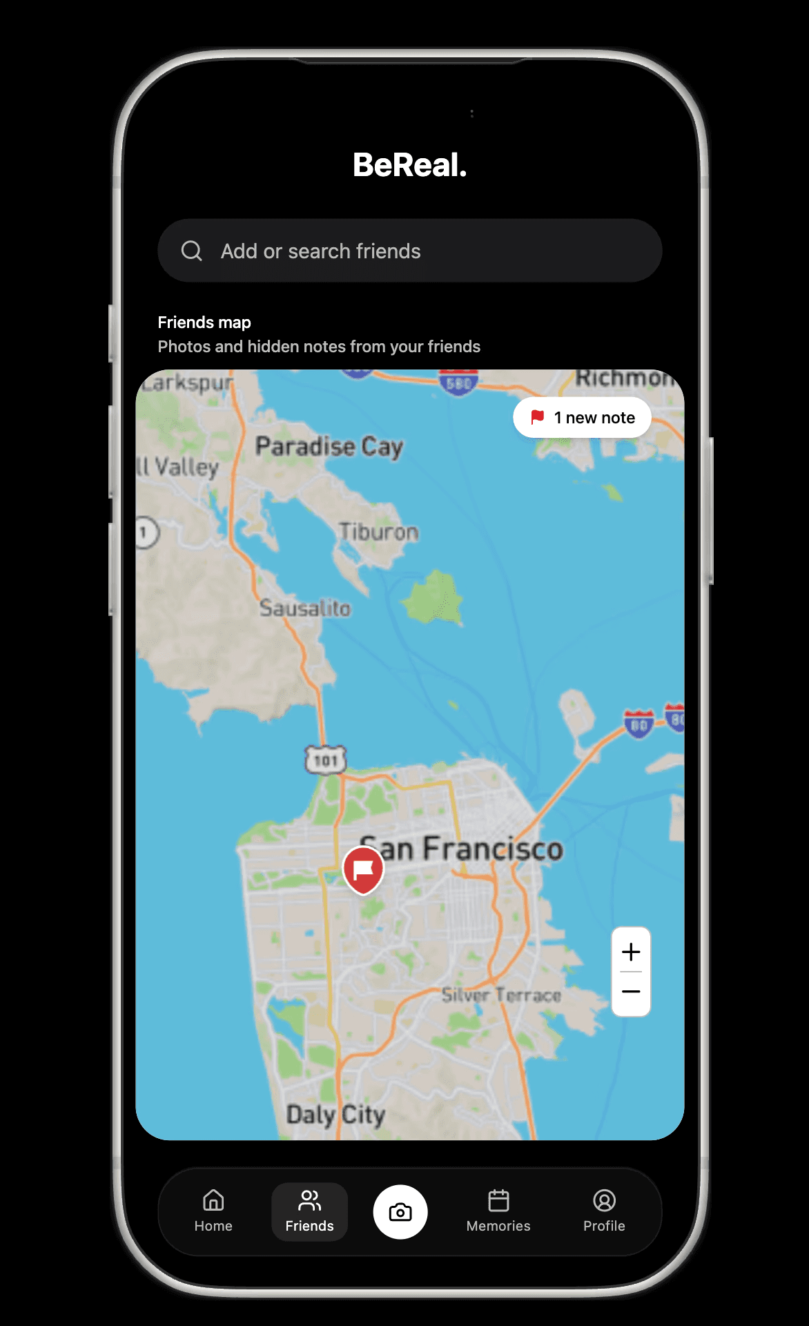
Large icons stayed clearly visible as users scrolled around

02

Designing a clear transition into the AR experience

Before

With no transition cues, users didn't realize they'd entered AR at all

After

A transition screen orients users to the space before they start looking for notes

03

Provide an onboarding within the experience

An onboarding flow explains the feature before users try it, leaving no room for confusion

WALKTHROUGH

Post hidden notes for friends to find in the real-world

Post hidden notes for friends to find in the real-world

Explore & uncover their notes in real life

Explore & uncover their notes in real life

Open on your phone to see the AR card float in your own space!

Open on your phone to see the AR card float in your own space!

Try it out

Try it out

LEARNINGS & TAKEAWAYS

Designing for AR challenged me to think beyond digital screens

This externship was super fun because I had to account for the user's physical space instead of just a digital interface. I had make sure the experience would stay helpful & fun, but not become distracting to the point of harm

Designing for user engagement

This externship was product-manager facing so for the first time I defended design decisions with metrics and business goals. I learned frameworks like RICE, and started asking how certain features would drive monthly active users before designing it

A glimpse into what design engineering feels like

Using a range of AI tools to build this feature gave me a real sense of how design and engineering meet in practice. I learned to recognize what's technically feasible and how to bridge that knowledge with my design decisions

If you've reached this far, we should connect :)

Every big idea started as a seed. What’s yours?

INSPIRED BY ALBERTA'S PRAIRIES

If you've reached this far, we should connect :)
